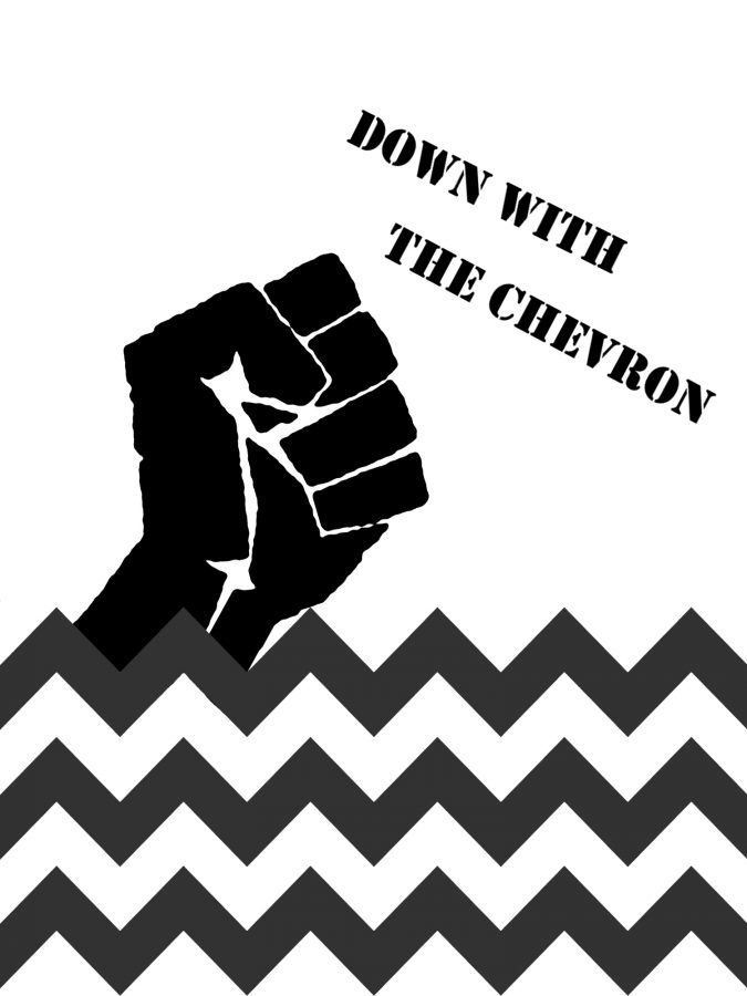
Down with the chevron
Maxi skirts. Decorative wall borders. Phone cases. Notebooks. Scarves. Cheerleading Bows. Teachers’ posters. Target pillows.
A moment of silence for the victims.
For those of you who remain unaware and unstained by the creative crime against humanity, chevron is the zig-zagged pattern, usually composed of two alternating colors, obnoxiously
plastered all over women’s accessories and Pinterest boards.
Update: It’s not cute anymore.
Actually, it never was.
I assumed the craze would fade after the year 2014 when Target’s Missoni collaboration reintroduced the design earlier that year, but no, it’s almost 2017, and chevron is still supplying most department stores…as if it’s a classic.
Again, no. Chevron is not only visually unattractive with its angular Easter-egg resemblance but it’s uncreatively simplistic. Whereas as the clean, simple, and classic patterns of stripes or polka-dots can be manipulated into further designs, chevron remains static and as cheesy as Chuck E. Cheese’s smile even when placed as a background for more imaginative designs.
So let’s let it die a great death and be eulogized by its most infamous advocate, Charlie Brown.
Down with the chevron.


